Measuring the Weather
Why do we measure the weather?
In everyday usage, weather refers to descriptive terms, such as fine, warm, cold or wet. This is adequate for everyday activities, but for industries, they require a much more detailed and quantitative assessment of the weather conditions, using standardised terms and reliable instruments. The science of the study of the weather is called meteorology, and meteorologists measure temperature, rainfall, pressure, humidity, sunshine and cloudiness, to enable them to predict and forecast what the weather will do in the future.
Temperature
- the hotness or coldness of something is measured using a thermometer, filled with mercury, which expands or contracts, which is measured with a calibrated scale. Most temperature scales are expressed in degrees Celsius, and occasionally in Fahrenheit.
Pressure
- although we are not aware of it, the air exerts a pressure on everything around it. Pressure is a force, or weight, and atmospheric pressure is measured by a barometer.
Humidity
- refers to the amount of water vapour in the atmosphere. It is the condensation of this which forms many other weather conditions, such as clouds, rain, snow, hail, dew and fog. There is a limit to how much water vapour the air can hold, which varies with temperature. Warm air can hold more vapour than cold air, and when the air contains as much vapour as it can hold, it is said to be saturated. The amount of water vapour can be measured in several ways. Measuring the mass of vapour contained within a packet of air is its absolute humidity. Relative humidity is measured by comparing the actual mass of vapour in the air to the mass of vapour in saturated air at the same temperature, and expressed as a percentage.
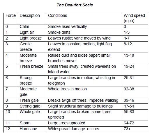
Wind
- the air is nearly always in motion, and this is wind, and its speed and direction can be measured. Its direction is expressed as the point of the compass from where the wind is blowing, and wind speed can be measured in miles or kilometres per hour, metres per second, knots or as a force on the Beaufort scale (see below).
In everyday usage, weather refers to descriptive terms, such as fine, warm, cold or wet. This is adequate for everyday activities, but for industries, they require a much more detailed and quantitative assessment of the weather conditions, using standardised terms and reliable instruments. The science of the study of the weather is called meteorology, and meteorologists measure temperature, rainfall, pressure, humidity, sunshine and cloudiness, to enable them to predict and forecast what the weather will do in the future.
Temperature
- the hotness or coldness of something is measured using a thermometer, filled with mercury, which expands or contracts, which is measured with a calibrated scale. Most temperature scales are expressed in degrees Celsius, and occasionally in Fahrenheit.
Pressure
- although we are not aware of it, the air exerts a pressure on everything around it. Pressure is a force, or weight, and atmospheric pressure is measured by a barometer.
Humidity
- refers to the amount of water vapour in the atmosphere. It is the condensation of this which forms many other weather conditions, such as clouds, rain, snow, hail, dew and fog. There is a limit to how much water vapour the air can hold, which varies with temperature. Warm air can hold more vapour than cold air, and when the air contains as much vapour as it can hold, it is said to be saturated. The amount of water vapour can be measured in several ways. Measuring the mass of vapour contained within a packet of air is its absolute humidity. Relative humidity is measured by comparing the actual mass of vapour in the air to the mass of vapour in saturated air at the same temperature, and expressed as a percentage.
Wind
- the air is nearly always in motion, and this is wind, and its speed and direction can be measured. Its direction is expressed as the point of the compass from where the wind is blowing, and wind speed can be measured in miles or kilometres per hour, metres per second, knots or as a force on the Beaufort scale (see below).
Precipitation
- the amount of rain, sleet, snow or hail which falls within a specific time and is measured daily using a raingauge. It is expressed in millimetres (occasionally inches) as the depth of water which would be produced on a large, level, impermeable surface.
Sunshine
- the amount of bright sunshine during daylight hours is measured using an instrument called the Campbell-Stokes sunshine recorder.
Interpreting Data
Weather and climate data can be recorded in a variety of ways. Here, two ways will be described:
- how to interpret a climate graph
- how to interpret a synoptic weather chart
When answering these types of questions, look out for:
- do they ask you to describe the graph or provide an explanation as well
- use facts and figures in the graph in your answer to show exactly what you mean or are referring to
- use months rather than seasons in your answer
A Climate Graph
Climate graphs are a combination of a bar chart and a line graph. They show average temperature and rainfall each month of a particular location, over a year. The temperature is the line graph, and the rainfall is the bar chart.
You may be asked to look at the information in a graph and describe the area's climate:
- Look for patterns in the temperature data - Is it the same all year round? If it varies, when? Number of seasons? Which seasons are the warmest and coldest? What is the range of temperature?
- Look for patterns in the rainfall data - Does the rainfall occur all year round? What is the rainfall pattern? What is the total annual rainfall?
- How do the temperature and rainfall relate to each other?
Synoptic Charts
A synoptic chart is any map which summarises atmospheric conditions (temperature, precipitation, wind speed and direction, atmospheric pressure and cloud cover) over a wide area at a particular time. Data is collated from many different weather stations, aeroplanes, balloons and satellites from numerous locations. This enables meteorologists to observe the movement of weather formations and predict their future behaviour and movements, and whether they will come to affect the local area. Charts are updated at least every six hours, and this allows meteorologists to make more accurate predictions.
There are many different types of weather map, but they all use internationally agreed standards and symbols.
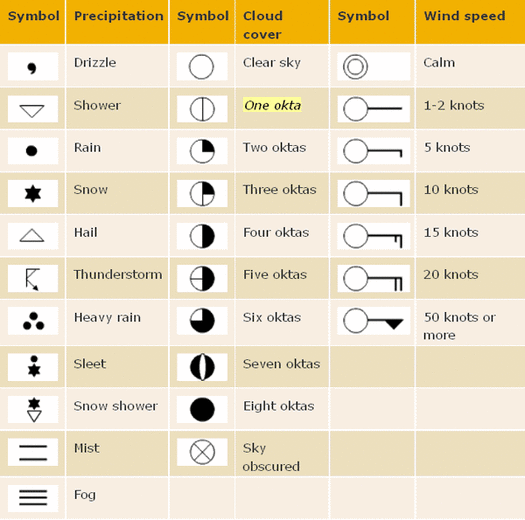
*an okta is a unit of measurement used to express the extent of the cloud cover.
The resulting charts look complicated, with lots of lines, squiggles, random numbers and letters, but once you can understand the figures, they actually provide quite a useful visual representation of the weather conditions (see below).
The resulting charts look complicated, with lots of lines, squiggles, random numbers and letters, but once you can understand the figures, they actually provide quite a useful visual representation of the weather conditions (see below).
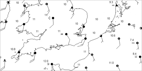
In this chart you can see the oktas scattered across southern England and NW Europe. Some oktas are completely filled in - complete cloud cover - and some have less oktas filled in. Their tails show varying wind speeds across the region.
|
|
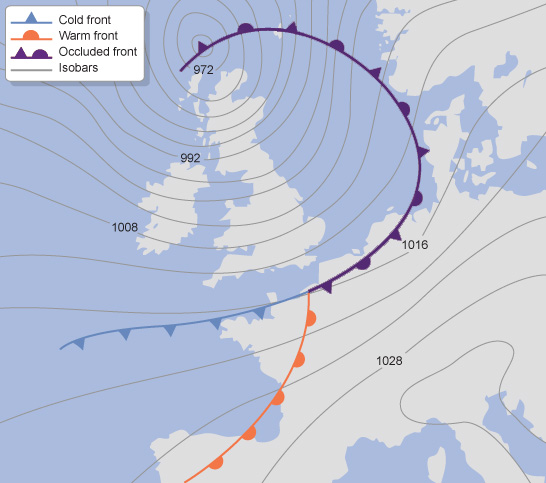
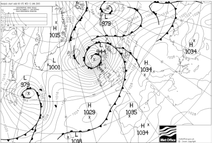
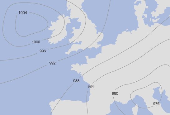
Isobars
Isobars are the squiggly lines (not the ones in bold with triangles or semi-circles on them) that can be seen on the synoptic charts above. The lines connect areas of equal atmospheric pressure measured in millibars. They are generally drawn at intervals of 4 millibars (one thousandth of a bar).
- the closer the isobars the windier it is
- if the lowest number is in the middle circle, this is a low pressure system, a depression or cyclone. Low pressures often mean strong winds and wet weather
- If the highest number is in the middle circle, this is a high pressure system or anticyclone. High pressure systems often mean dry, sunny weather
- Air pressure tends to range from 890mb (a hurricane) to 1060mb (an anticyclone)
The wind direction tends to be parallel to the isobars, blowing clockwise around areas of high pressure, and anticlockwise around cyclones (in the Northern Hemisphere).
On the map below, where is the depression, and where is the anticyclone?
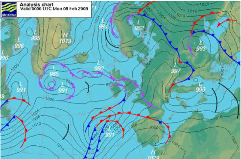
Weather Fronts
Different fronts are also represented by different symbols on the weather chart. There are three different types of front, a cold front, a warm front, and an occluded front. Fronts occur when two different air masses meet.
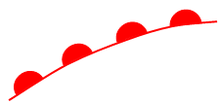
A warm front is represented by a red line and semi-circles.
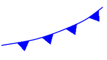
A cold front is represented by a blue line and triangles.
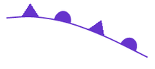
An occluded front is represented by a purple line, semi-circles and triangles.
Task:
Using the weather map below, describe:
- what weather systems you can identify
- where are they
- what direction the wind is blowing at within these systems
Using the weather map below, describe:
- what weather systems you can identify
- where are they
- what direction the wind is blowing at within these systems